Kimberly-Clark approached us to develop a best-in-class experience that empowers their global teams to create aligned brand excellence in every geography for every brand.
The work included a new digital experience design and an updated visual identity to bring the platform inline with a new corporate identity.
The New K-C Way
The Framework
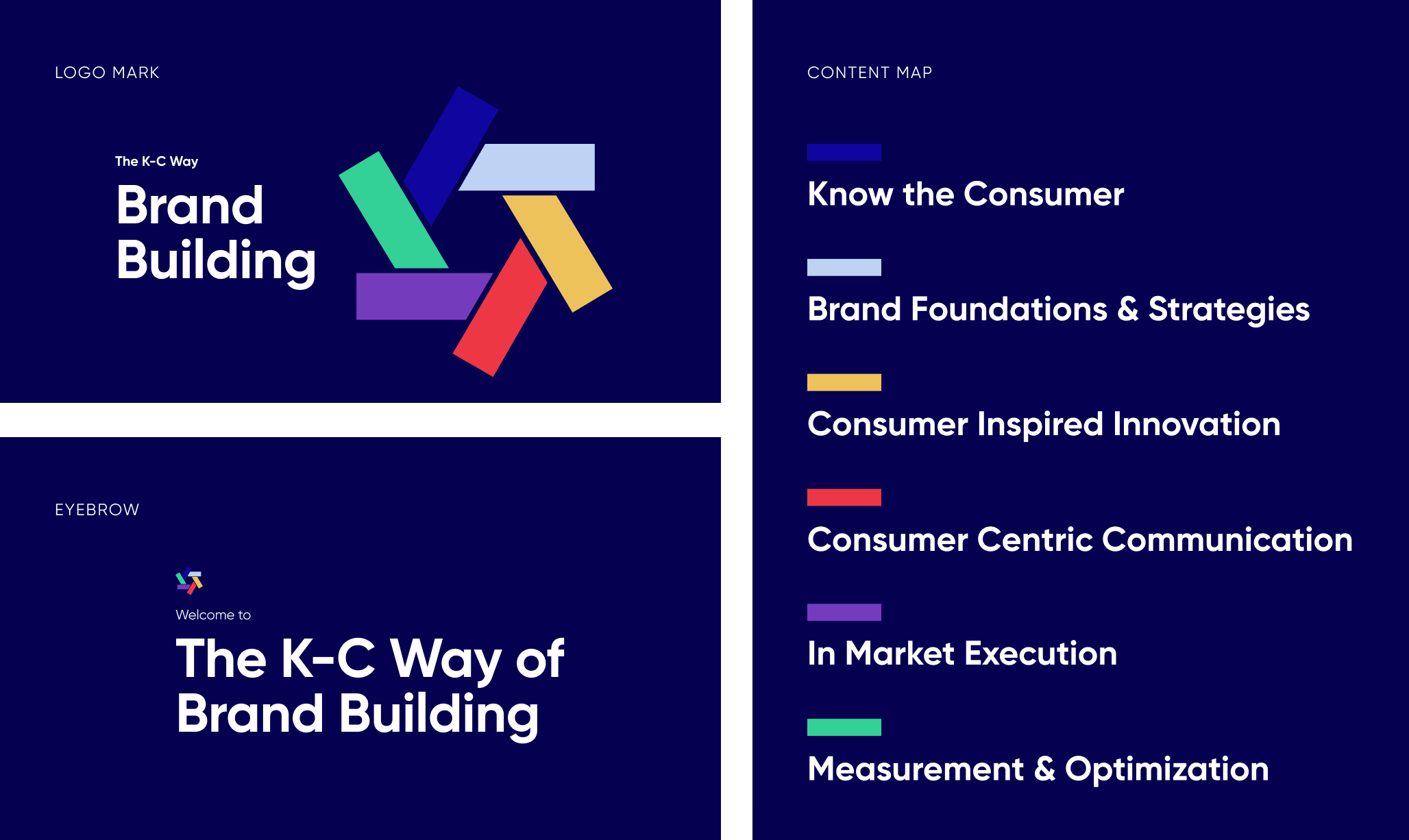
The K-C Way is a multi-functional framework that outlines how Kimberly-Clark build brands and business. It defines six strategic pillars that all K-C businesses and brand builders need to know. The identity is a North Star for K-C branding.
When developing the visual representation of the new framework we looked to the current K-C Way framework design as a starting point. There were elements we wanted to carry over and elements that needed to be reevaluated.
Directives from the parent brand and original K-C Way
The equity of a circle in the original state lent itself nicely to the framework of content coming together to create the K-C Way as a whole. However, the overlap implies connections across all content which are not there in reality.
Pulling in elements such as typeface and color from the Kimberly-Clark parent brand served as a nice connection between the two distinct but connected brands — a connection that was not made in the original state.
To establish a deeper connection to the parent brand, the Kimberly-Clark logo became a source of inspiration. There is one consistent shape which appears throughout the logo mark — a rectangle. And, conveniently the logo-mark showcases six of these rectangles which aligns with the six new pillars of the K-C Way.
Establishing the Brand
A comprehensive design system and set of brand guidelines was established to bring the new K-C Way to life and ensure consistent implementation.
The Platform
For first time users we introduce them to the K-C Way of Brand Building with an onboarding experience that serves two purposes — an overview video of the K-C Way and a personalization quiz.
The landing page provides an intuitive dashboard that elevates the K-C Way Pillars, the users’ personalized content, and an enhanced search.
K-C WAY HERO
The hero of the page delivers an updated branded element that links the user to the K-C Overview page.
SEARCH
A prominent search bar is included to emphasize the enhanced, natural-language search feature.
6 PILLARS ACCORDION
The left column of the page orients the user to the 6-Pillars of the K-C way, allowing them to quickly open each to reveal the content included in each.
PERSONALIZATION
The right column contains all of the brands & sectors the user is following as well as any content they may have favorited.
The primary navigation leverages a traditional top-line navigation with optional drop-down menus, providing a globally accessible navigation for all content.
K-C WAY
This drop-down lays out all the underlying approaches in a clean UI, making it easy for the user to find the content they’re looking for.
BRAND & SECTOR
Pulls in personalized brands for the user to quickly access the brand pages they are most interested in. Also provides a quick link to the B.I.G Resource Center.
The approach detail page provides a clear UI for the
user to preview, share, and download the corresponding pages’ toolkit(s).
CTA CARD
The CTA card follows the user through the scroll experience to provide an easily accessible reference to download, share, preview or favorite the corresponding content.
SIDE NAVIGATION
The secondary navigation is leveraged to orient users to the depth of content within the approach and cross-promote users to brands and other pages.
PREVIEW MODAL
The user is also able to expand documents to view a preview of each piece of content.
Specs.
ROLES
2 UX Designers
1 UI Designer (Me)
1 Content Strategist
TOOLS
Figma — design & prototyping
Keynote — presentations


